Restaurants have surplus but perfectly-fine-food that has no where to go but the trashcan (or in rare cases, compost);
People want yummy food but it’s too pricey;
Hence the head-and-heart-aching problem of food waste.
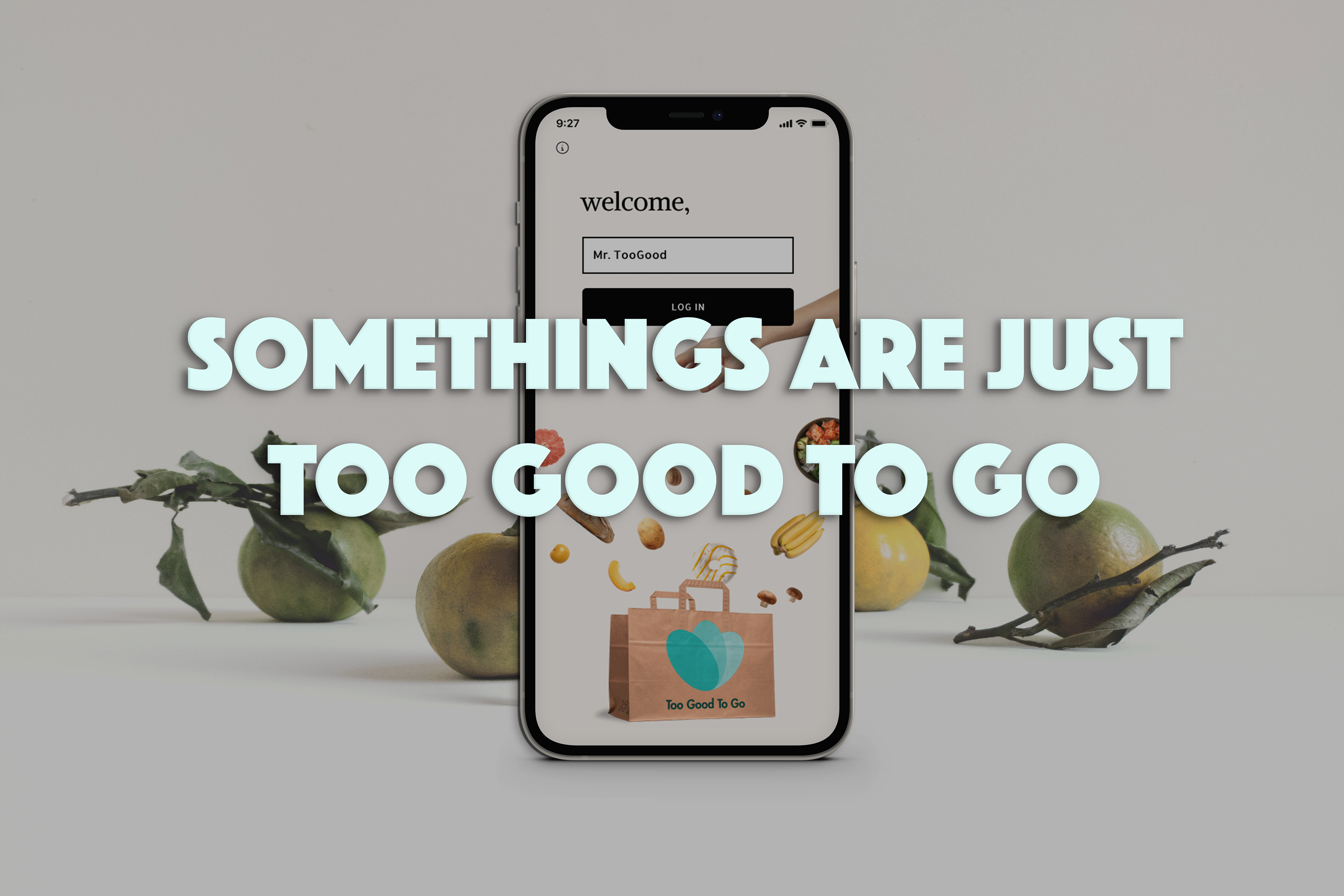
Toogoodtogo is an elegant solution to that: restaurants with surplus food posts in the app and people could order and pick them up later in the day at a discount price. The app became so popular among our circle of study-abroad students in Copenhagen that we still about it today.
It also debunked my constant hesitation towards tech products: is every solution towards a design problem a new app? In this case, it built a bridge between restaurants and hungry or busy people, which is when a new app became the most efficient and sensible approach. Not just one set of user needs, but two or more could be satisfied at the same time.
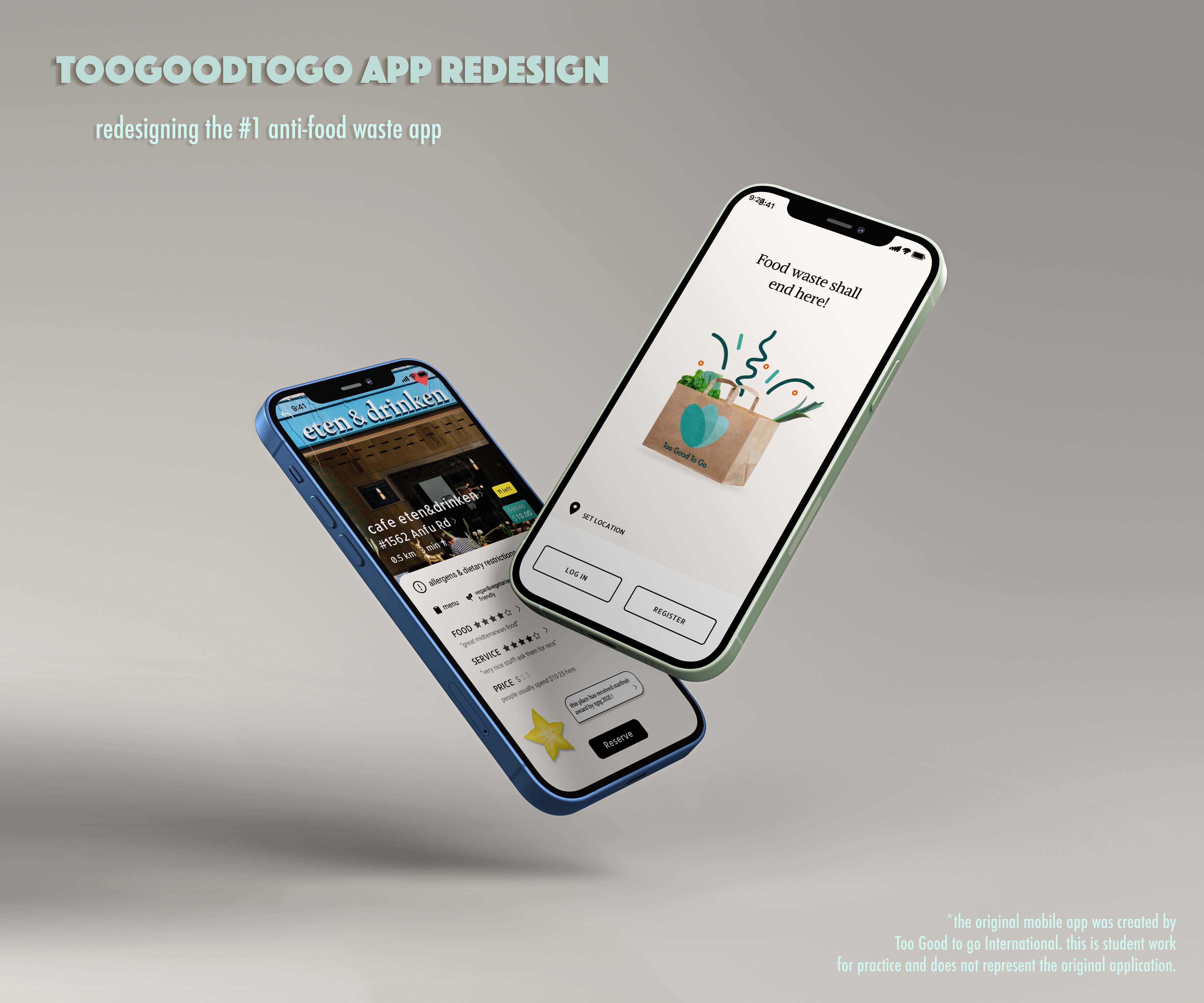
The current UI of the TooGoodtoGo App
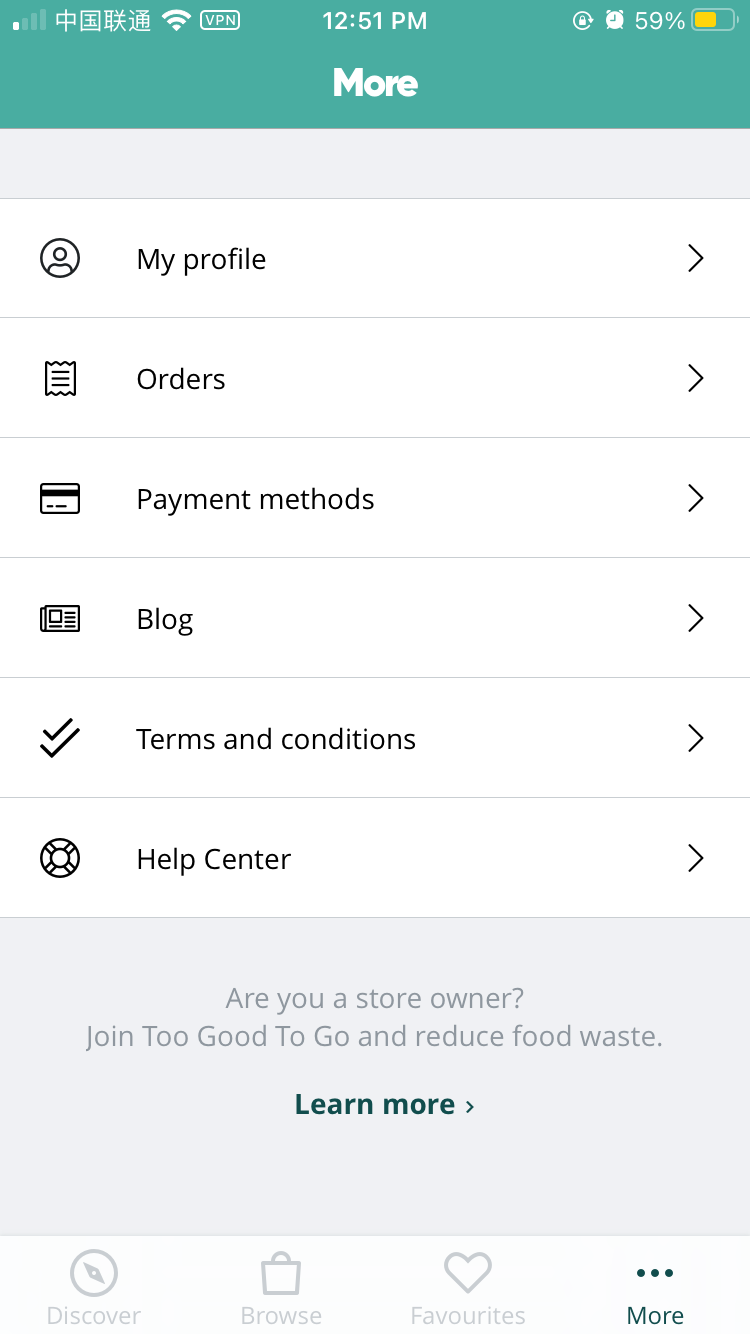
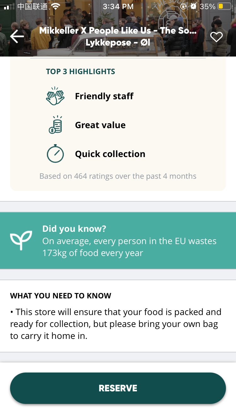
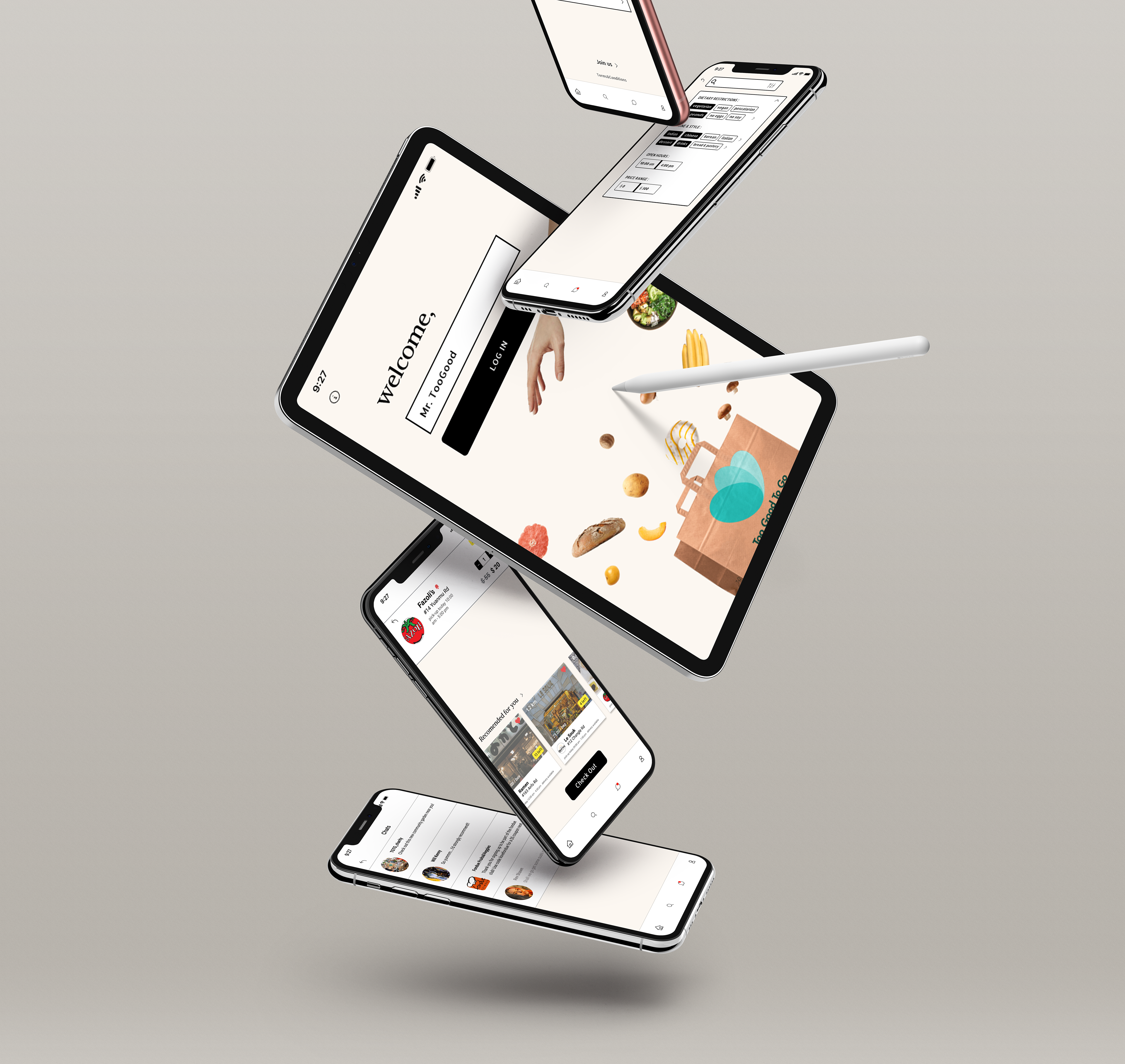
I loved it as a user before seeing it from a design perspective. It already works fine, but I saw some room for improvements for its UI and prototyped my own attempt:
- a new style focusing on fluent user-flow and playfulness
- better organization and prioritization of its features
- expanding the app's capacity to become a restaurant/shop guide as well by adding ratings&comments feature
Redesign
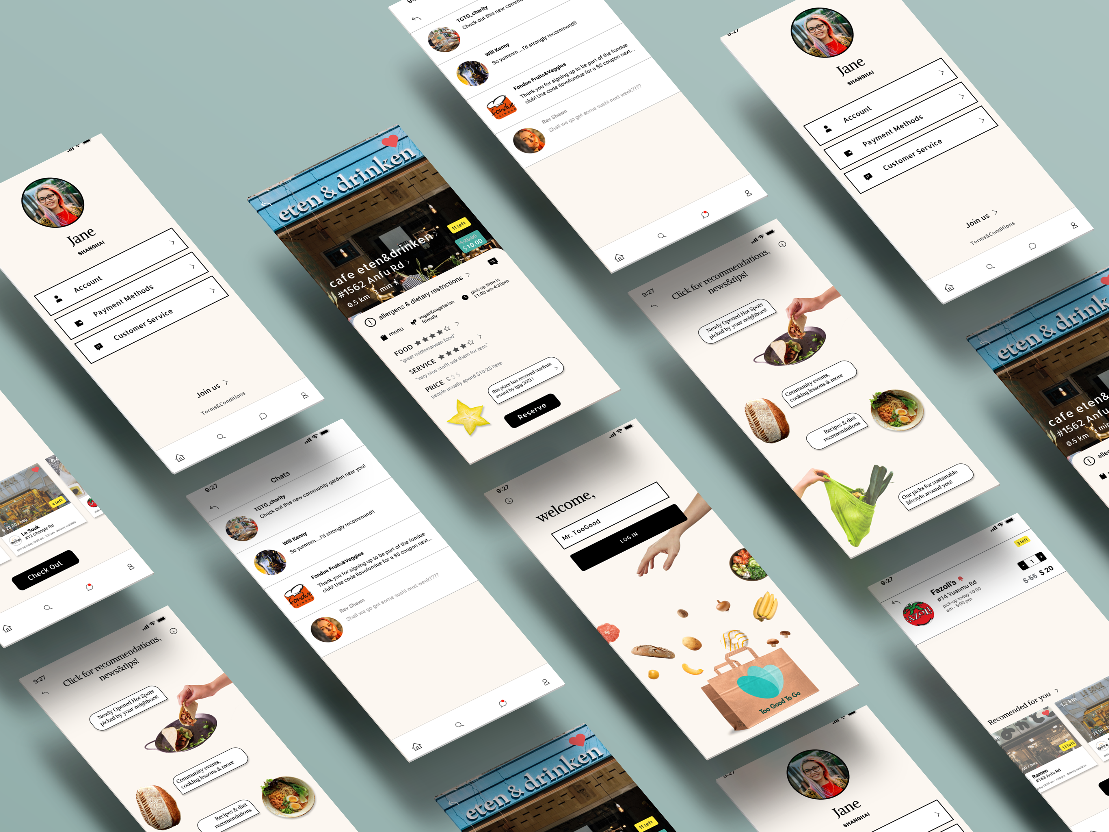
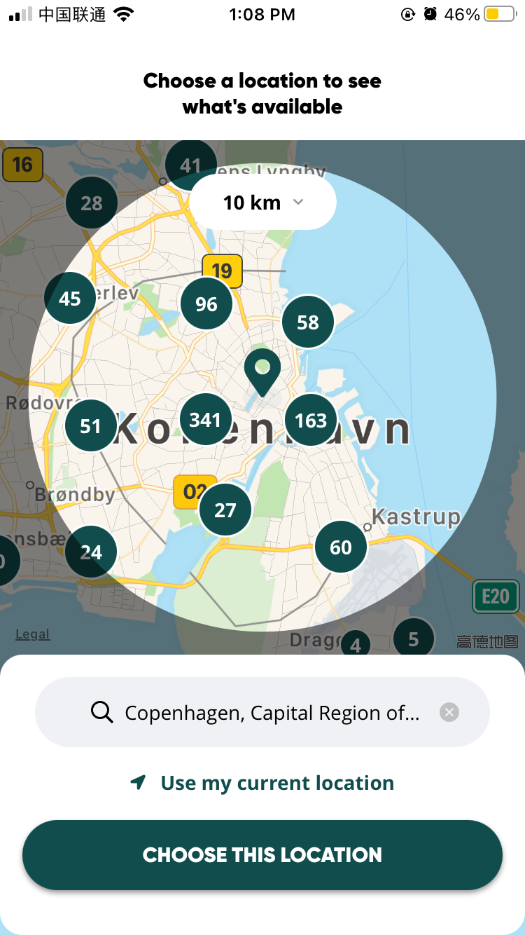
Select Location
Logging In
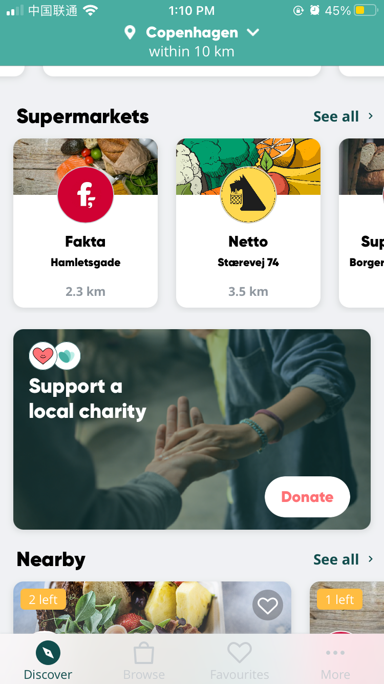
Navigating Main Page
The 'Pizza' function
- added a 'pizza' icon&function which made the old blog feature more visible and interactive
- included any community messages and info in 'pizza', instead of unorganized and disrupting the flow of the main page
- created a more comprehensive filter page for searching
- added more helpful info for users on the restaurants’ info page
-replacing 'more' in tab bar with 'account' and reorganized its features
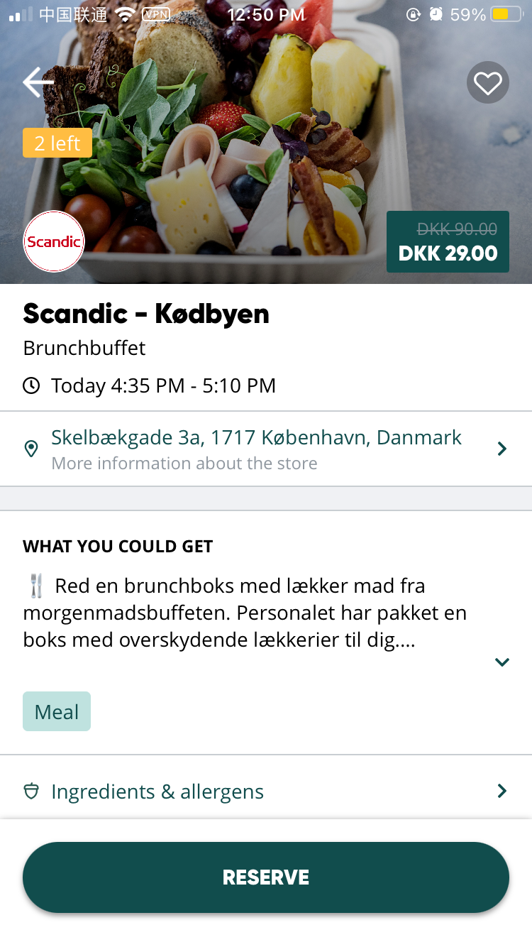
Checking Out
Messages & Chats
- replaced 'favorite' with 'messages' feature in tab bar to encourage interactions among users and shops
Software: Figma, Adobe Photoshop